The client required concepts to showcase to investors. We simplified the UX of the current Database Visualization workflow and delivered a clean design system that was cohesive to use. A comprehensive set of data, code, and chart components were created.
I am a design team of 1, and my role is to work closely with clients to create a design style guide and key product concepts for investors
SQL-based data visualization is foundational for communicating insightful data, but the tools available in the market are often too focused on the technical side. We aim to streamline the database-query-visualize workflow and lower the learning curve to create storytelling visualizations
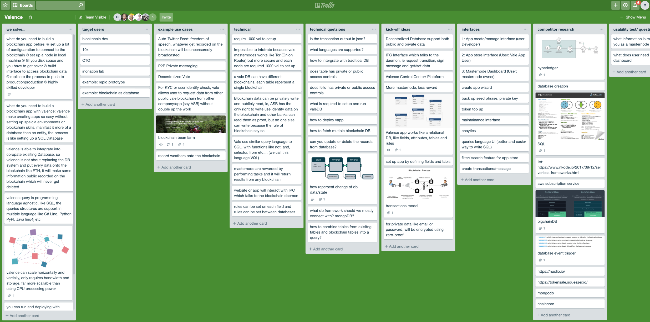
This project is data-driven and technical. We scouted through existing products like Tableau and Bigchain to solidify the niche client is tapping into and bring a fine-grained definition to the client's vision. Later, we delved into the technical aspects to work out a few scenarios for our workflow


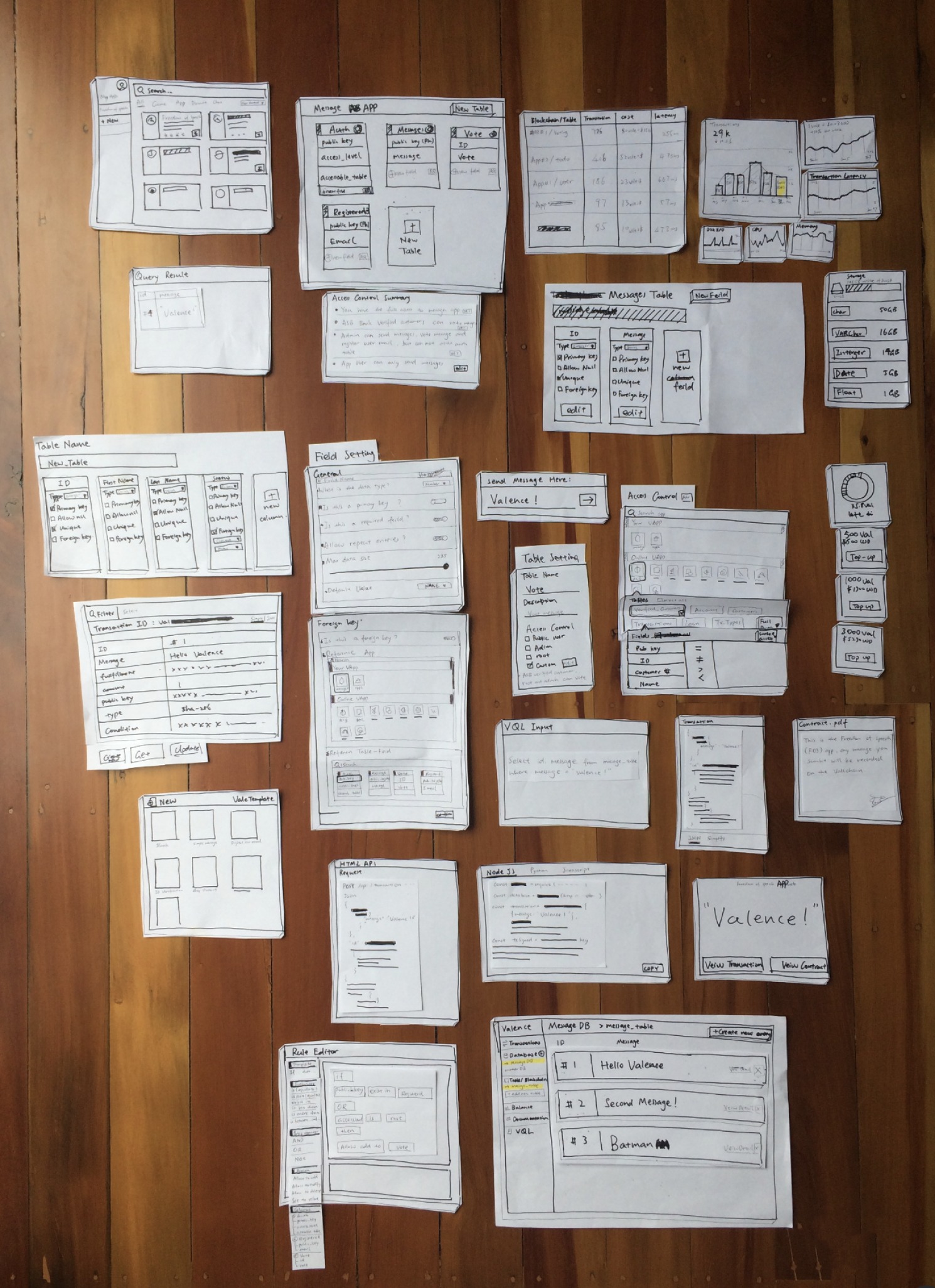
Paper mockups were a good way to communicate initial ideas to developers and clients. It laid out all the different modules we are interested in building and allowed us to assess them from a business opportunity, UX, and feasibility point of view. We could quickly shuffle them to create different 'pages'. The prioritization was later refined using actual prototyping

~breathe~

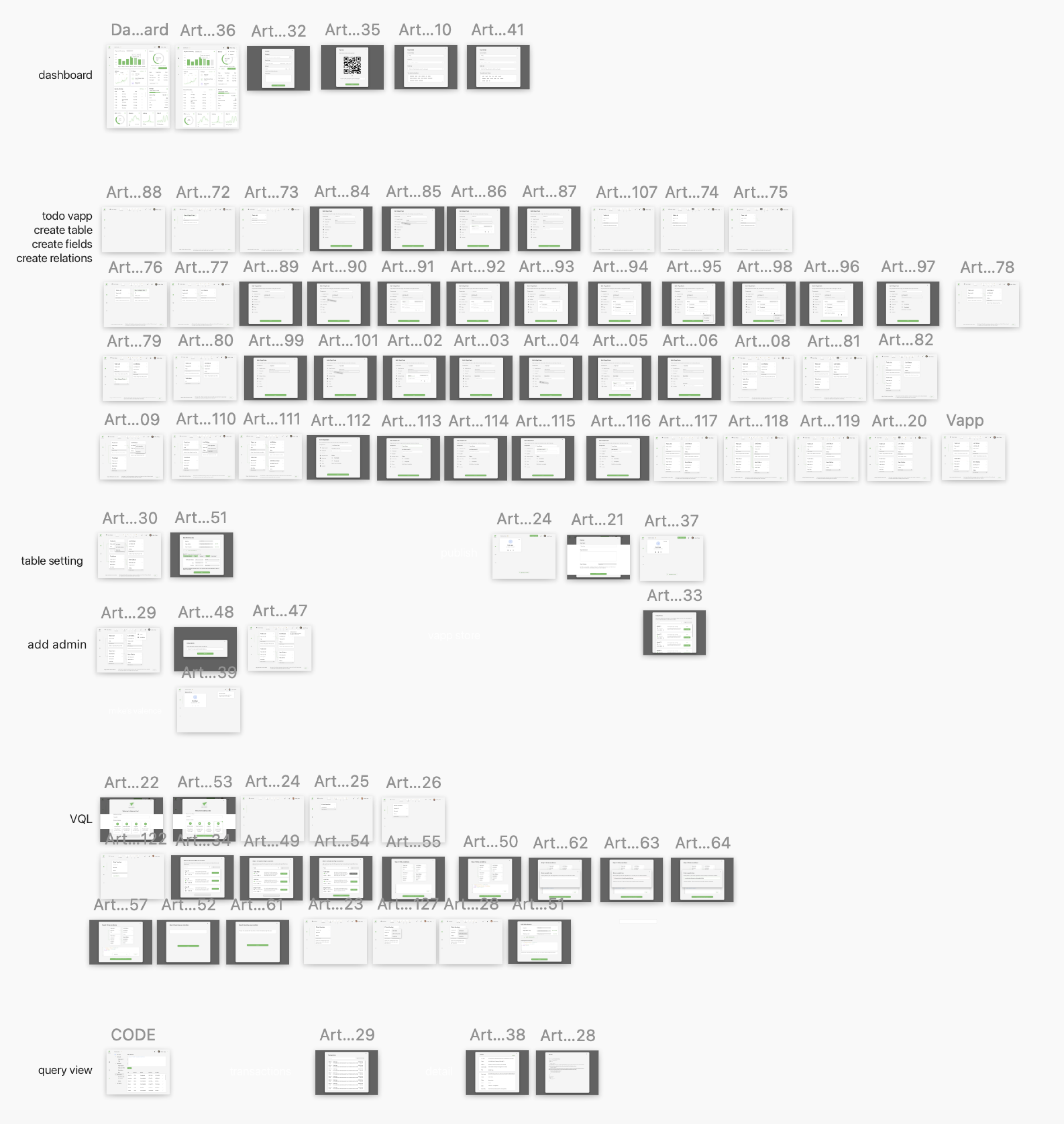
We have delved into multiple scenarios: creating tables, setting up databases, managing table permissions, customizing fields, generating SQL queries, and visualizing data. As a result, we have put together a set of black and white wireframe screens.
We engaged data analysts and technical leads through friendly connections and Askable for their valuable input. This helped us uncover blind spots and provide a clearer narrative for the product strategy.
Through assumption testing with new users, we pinpointed areas of concern, such as navigation hurdles and struggles with managing complexity. This helped us to focus on improving those weak links and also reinforced our initial hypothesis that simplifying the experience as we progressed towards concept at a higher fidelity.
There were great insights around our prototype and their current analytic tools, with a few standouts:
"It is difficult to navigate from a report to the code. Also, reports come up with small print."
"It should handle data at scale. We have a database with 50 tables."
"Tableau is like Photoshop for data, it is powerful but requires time to learn."
~breathe~
Start with designing key screens, taking into account our tested scenarios. We reassessed the font size, density, navigation structure, icon affordance, as well as the layout, detail panels, and overall simplification based on the insights we've gained from usability testing and user feedback on existing products.
Given that the project encompasses numerous components such as forms, charts, tables, cards, canvases, and code, it's crucial to showcase a design system to investors. This design system will ensure consistency across the app and streamline efficiency through design. Moreover, it will emphasize the reusability of components, making them quicker and more cost-effective to build.
