Document Management UX Redesign
Our journey begins with the goal of simplifying document management for accountants. We aimed to create a seamless experience that satisfies our existing MYOB customers when integrating with Nimbus.
Our journey begins with the goal of simplifying document management for accountants. We aimed to create a seamless experience that satisfies our existing MYOB customers when integrating with Nimbus.
I worked as a transition designer on this project for a duration of 1.5 months. My role was to ensure a smooth transition and handover before another designer took over
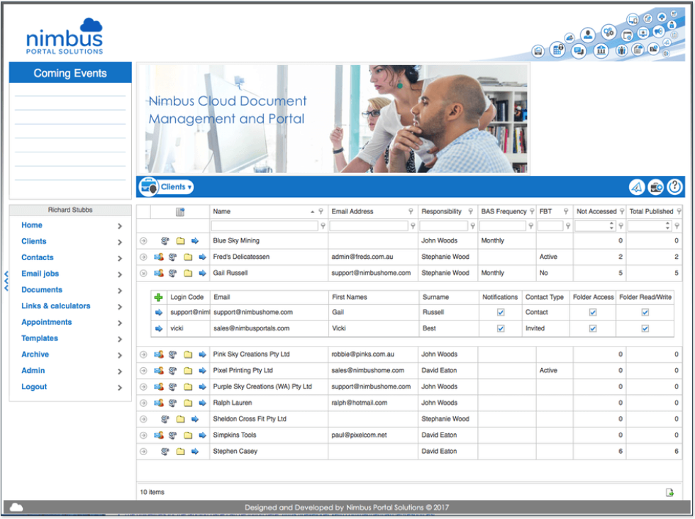
The Nimbus integration aims to collaborate seamlessly with the MYOB products, However, there are challenges related to user familiarity and the underlying complex architecture, which pose risks to adoption and result in an confusing experience.
MYOB Practice Online
MYOB Essentials
I came realize that in order to bridge this gap, we needed to lay the foundation for our redesign efforts based on user input.
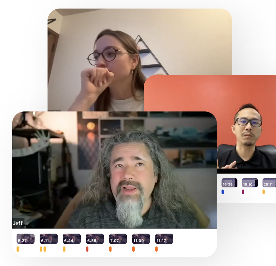
Focusing primarily on the usability of documents and web forms, I conducted 5 observational interviews. I carefully monitored how users engaged with the Nimbus demo account while performing the given tasks. Additionally, I aimed to evaluate its quantitative usability using the UMUX scales.
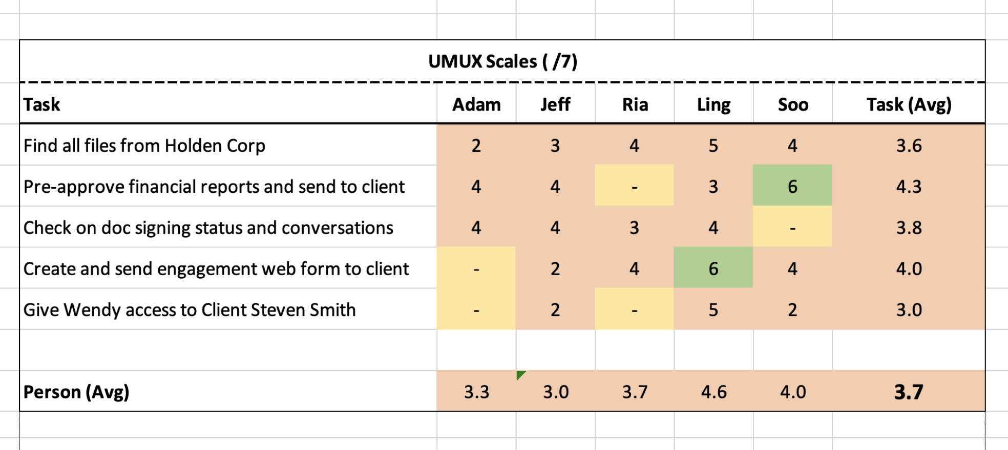
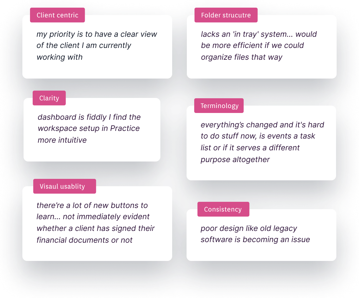
OVERALL: 3.4/7, indicating that we need to improve the experience for some of the most common tasks. Other bite-sized insights: 3 of 5 users couldn't find document conversations without prompts. The navigation dashboard is for 3 of 5 users. Document organization requires a learning curve; the tree view was not intuitive for scanning. Forms need improvement as they don't come across as professional-looking for client use. Clarification is needed on terms used, particularly related to events and folder names.
Played back insights to stakeholders, we defined 3 key redesign priorities: making the practice dashboard more informative, focusing on client-centric documents, and ensuring visual and terminological consistency.

After UX evaluation the PM agreed to move forward with the re-design which enabled a full range of user experience improvements.
~breathe~
We've already implemented Feelix in MYOB products, and now we want to extend its usage to Nimbus too. As Nimbus will eventually be integrated with Practice Online and Essentials, adopting the same design language ensures a cohesive visual experience across all our products.
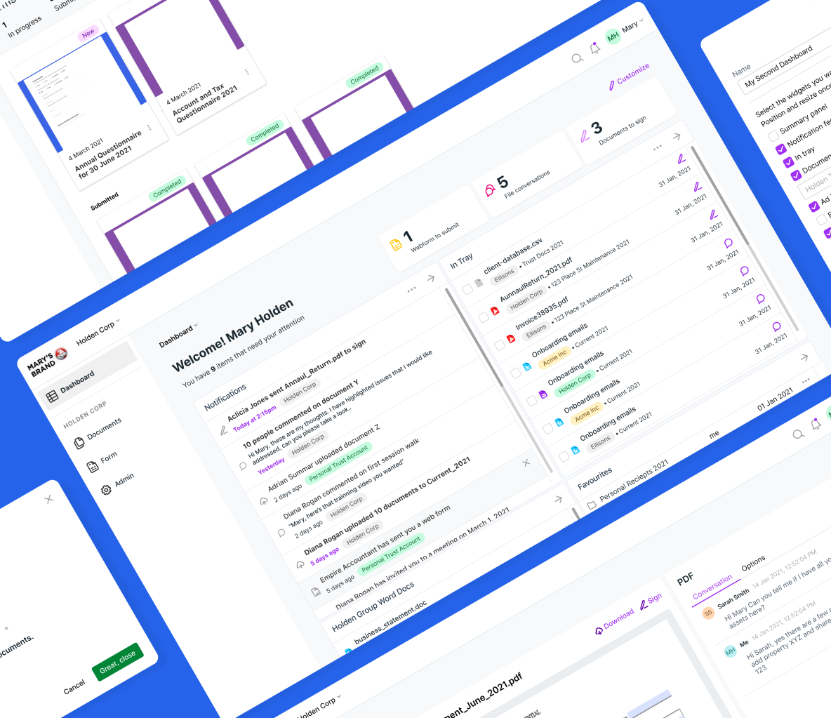
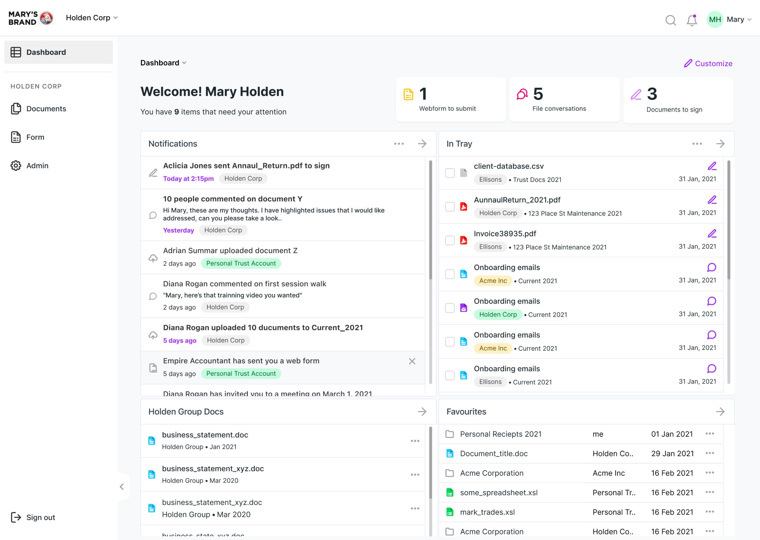
The new dashboard grabs attention by utilizing tiles allowings accountants to perform quick actions.
In terms of feasibility, we leverage the existing functionalities of customizable panels in Nimbus, but we adapt them into the dashboard to provide an organized view. This way, we can surface all crucial information such as what needs to be signed, what requires review, the latest updated documents, and actions related to the most frequently used files.
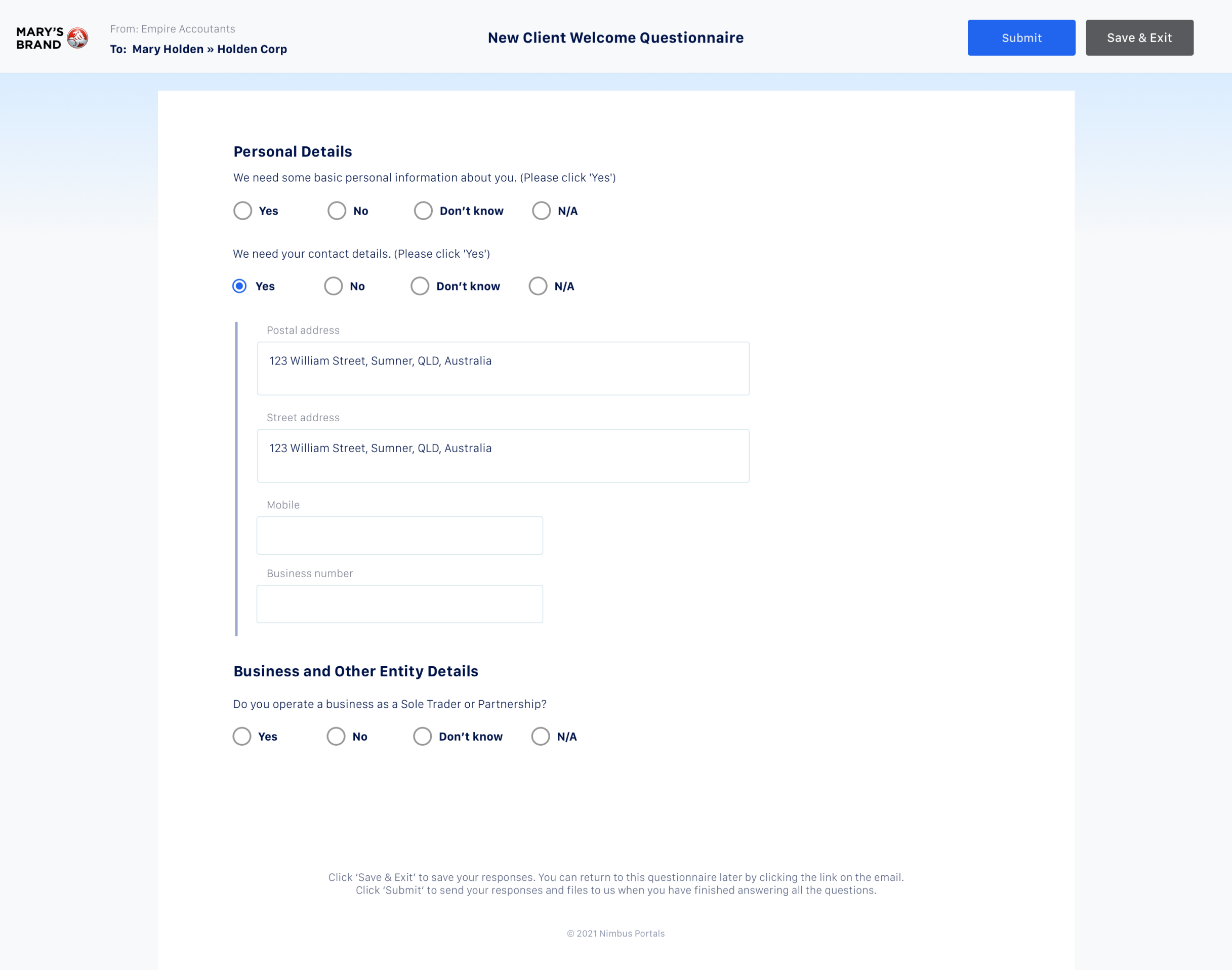
Renewed the client questionnaire deliver a more professional looking client checklist.
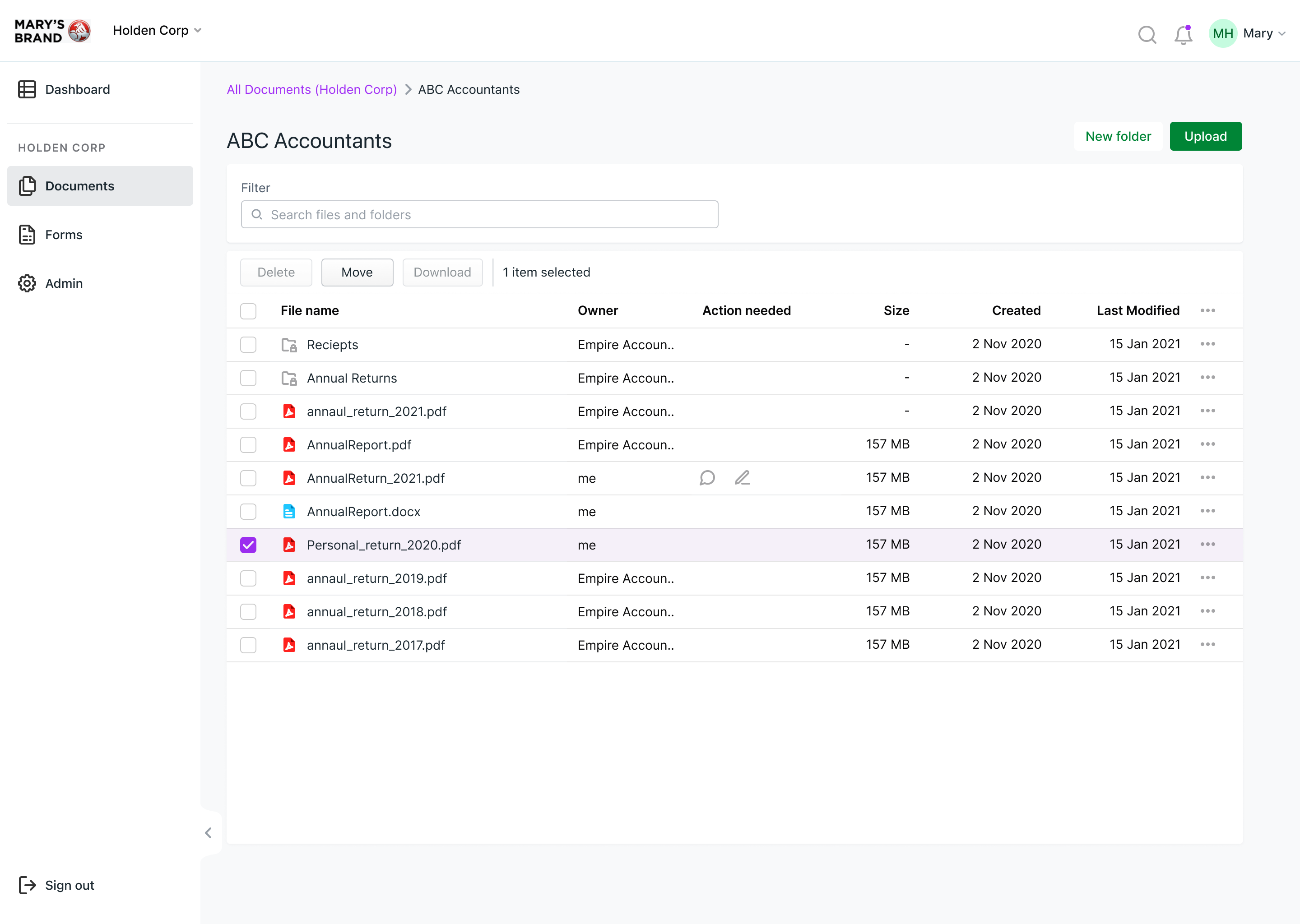
We also default to client-centric documents list based on user feedback and opt for a simple list view, which is more familiar and easier to develop.
Additionally, we proposed breadcrumbs for easy navigation within the folder structure and decided to hold off on tree navigation caused inefficiencies in page scanning during testing when users were tasked with quickly locating desired files.
We found that some users like to have visual thumbnails for documents in Nimbus, so we kept that as an option for browsing Forms.
For better clarity, we will also adopt the Split-screen from the MYOB design library. This allows users to view the document while keeping track of the conversation with the client and the signing status.
